✕


.png)
In the U.S. houseplant sales have increased by 50% in the last three years to $1.7 billion. The industry is thriving thanks in part to millennials and their obsession with plants. In the midst of this nationwide boom, the internet and social media have emerged as a forum for plant owners to share advice and their love of plants. These outlets have made the spread of knowledge more accessible to a larger audience but many still have difficulty caring for their plants. Plantern is an app used to ease those difficulties and improve the experience of caring for plants.
People interested in houseplants have difficulty keeping them alive & healthy. I wanted to explore how I might improve their experience of caring for them and make it an enjoyable hobby.
The first step in the process of finding a solution was investigating the problem space. I conducted secondary research to learn about my target audience, the problems they face, and the motivations that drew them towards houseplants.


Once I had a general understanding of the problem space I wanted to get a better picture of how houseplant owners behaved and the specifics around the difficulties they face. To obtain this information I needed to speak to houseplant owners first-hand. I sent out a survey to recruit participants and used my findings from the secondary research to guide the selection process. In total, I received 21 survey responses and narrowed my selection to 7 interview participants.
Participants were urban or suburban-dwelling millennials who owned anywhere from 1 to 5 or more houseplants. Participants ranged from novice to expert in skill & commitment level. By selecting a diverse sample of participants I was able to gain a more accurate picture of my audience as a whole.
Each participant was interviewed remotely for 30 minutes. The interviews helped me gain a better context of the routines and techniques used while caring for plants. I also gained insight into the challenges faced and the different solutions used to resolve those problems. To see what patterns emerged from the interviews I organized my finding into an affinity map.

I was able to compile enough information to create a persona that represented my target audience. Before jumping into the construction of my persona I used an empathy map to help visualize and articulate the defining characteristics associated with that persona. Meet Kate, she represents my target audience. All decisions made from here on out were made with her in mind.

My research and findings led me to some key insights
I used these insights to construct a list of problem statements. From there I brainstormed possible solutions and organized my ideas using an affinity map.
From the perspective of the user, I constructed a list of tasks one might want to complete. Priority was given to essential tasks that were critical to the product’s success. These top-level tasks would be translated into features that would make up my minimum viable product.
.gif)
Now that I had an idea of features to implement into my product it was time to figure out how I would organize this information. I needed to structure it in a way that was intuitive and based on mental models my user would understand. The end result of this organization was the creation of a sitemap. It would be used to help visualize all the different screens within the product.
With a blueprint in hand, I set out to create user flows so I could visualize the steps my user would take to complete specific tasks. I focused on two critical paths that were key to the functionality of my product.
It was time to give my ideas life. I translated my red routes into low-fidelity sketches. This way I could test out the functionality of the product and make changes quickly before progressing further into the design process.


To assess the functionality of my sketches I conducted 5 moderated usability tests. Each participant was asked to complete two tasks. I wanted to see if any difficulties arose in the process and if participants were able to comprehend the key functions of the product.
Based on the results of my tests there were a couple of changes that needed to be made to improve usability.

Eliminate ambiguity by clearly stating purpose of button
Eliminate ambiguity by clearly stating purpose of button


Help users identify their plant by utilizing AI for identification
Help users identify their plant by utilizing AI for identification.

I converted my sketches into wireframes to help me visually prioritize the content and understand the spatial constraints I was working with. Being devoid of color, I was able to focus on the layout and the relationship between the different elements. During this stage, I worked through edge cases and completed wireflows of my red routes.


The next step in the process was turning my wireframes into high-fidelity mockups. Because I was creating this project from the ground up there were no design systems or style guides to adhere to. Therefore, I had to create a visual language that would unify the product and create a cohesive feel across its entirety.
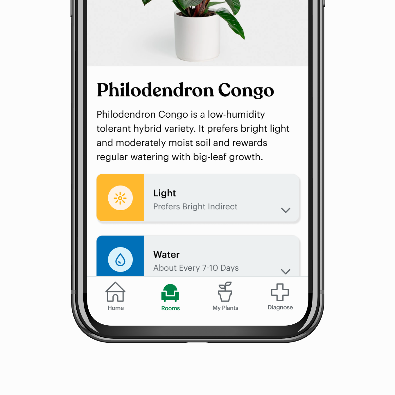
Once I had established a style guide I was able to easily translate my wireframes into high-fidelity mockups. These screens were a representation of what the product would look and feel like.


After I had completed my high-fidelity screens it was time to convert the mockups into functioning prototypes for testing. I wanted to identify areas of my design that needed improvement so once again I returned to usability testing. This time around I recruited participants who matched my user persona. I performed 2 rounds of moderated usability testing with 5 participants in each round. There were two objectives for these usability tests.


There was a lot I learned throughout this process. This was the first time I designed a product from front to back. It allowed me to apply newly acquired skills and knowledge as well as improve upon other abilities I had within my toolkit. And although I’ve seen considerable growth there are definitely areas for improvement. Below are some of my main takeaways.


.jpg)
